Aprilaire B2C
Introducing a legacy brand to an entirely new market with a careful overhaul of digital touch points and brand positioning.
Creative Director – Growth & Web
Product Design
HVAC Industry
WEB UX/UI
Executive Summary
The established B2B air filtration company set aim to enter the B2C market, a new landscape with established competition. Our team crafted a comprehensive plan to both expand their reach to consumers directly, as well as offering new tools for partners to close sales. This was achieved through a complete UX/UI Overhaul. Including new educational resource platforms, seasonal landing pages, content design, and a scaleable design system.
Team
Self, Anthony Galasso, Alison Hinz
Agency
Again Interactive
Timeline
Multi-Year Partnership
Tool Stack
Figma, Adobe XD, Zeplin, Photoshop
Baseline Analysis
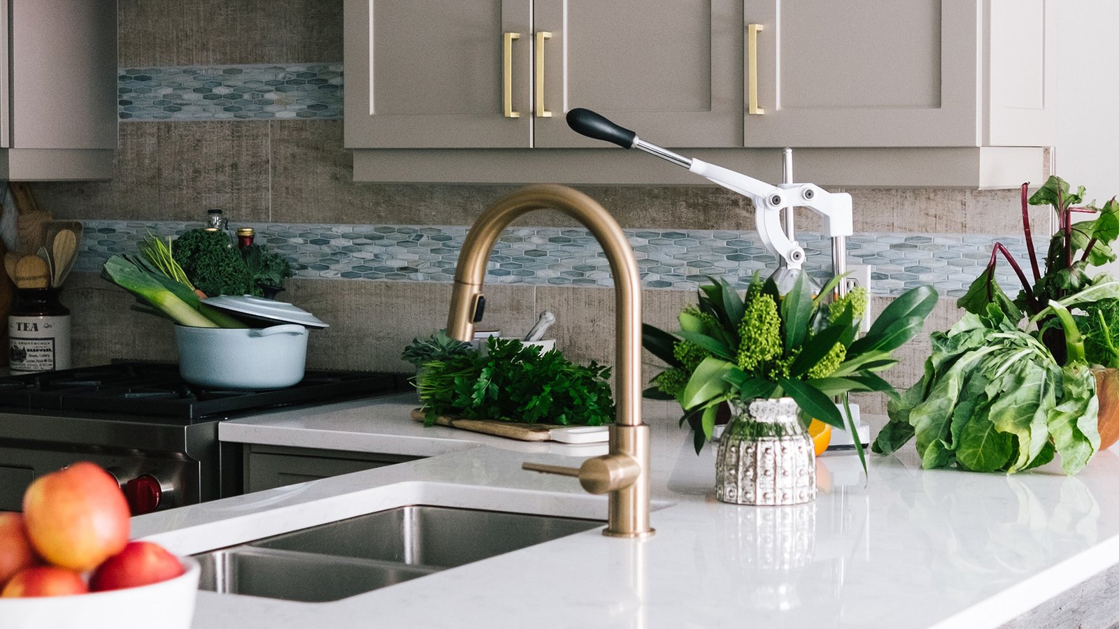
It was easy to see the upside from where Aprilaire was starting even without legacy metrics to look at. As it currently stood, Aprialire.com was strictly business. Content was speaking directly to industry partners, distributors, and contractors. That said, there was no limit to the potential of creating a health-conscious culture around the benefits of home air quality. Aprilaire was granting us free rein to build a new brand around their existing one.
Plan & Execution
Starting with a new codified brand design system, we built out guidelines that would help inform every decision moving forward. What followed was an entirely new website, resource portal, educational platform, blog, and a full ecosystem of campaign landing pages with it’s own interconnected design system.
Codified Branding
Problem
Aprilaire was missing a core brand identity. The logo and ‘Madison blue’ color had long-standing brand equity but they were missing core guidelines around colors, typography, and imagery. With the new B2C approach, I built a design system that would allow retention of recognition while opening the door to new methods of communication.
Solution
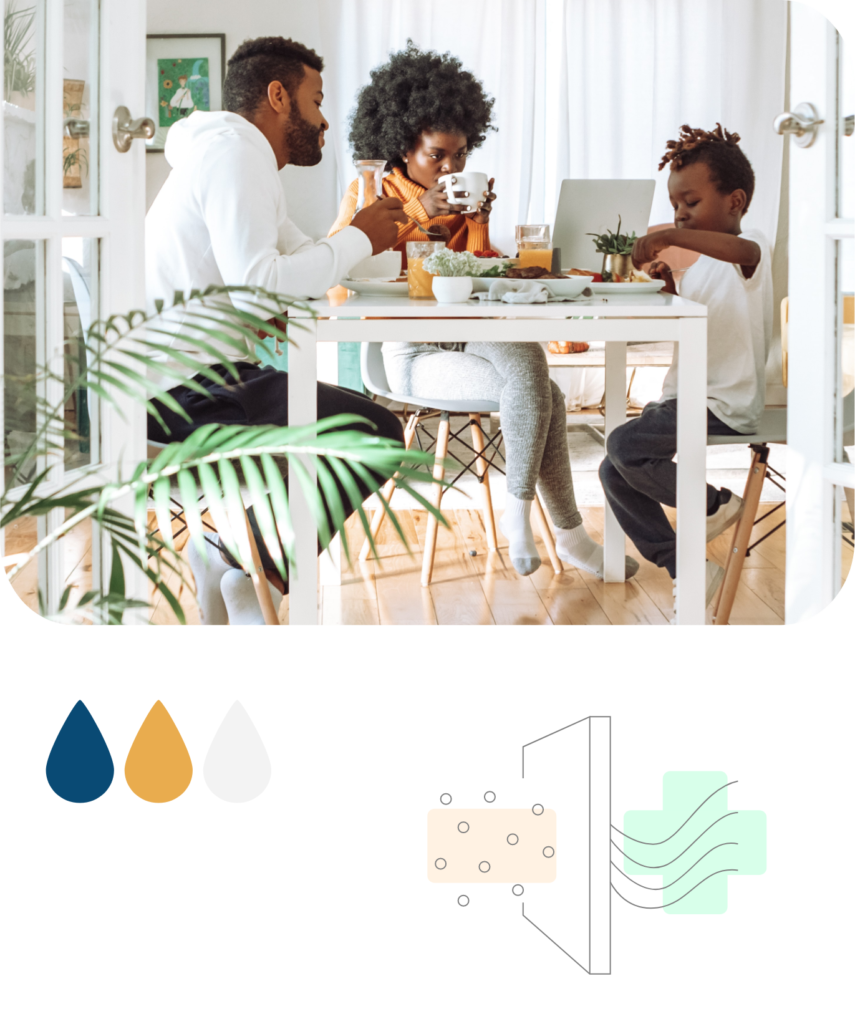
I started with accent color, something to compliment the legacy blue but represented a warm and more human element. This updated palette would inform the core branding for Aprilaire. From there, a more complex system of colors and shapes with symbolic meaning would emerge.
Campaign Taxonomy
Problem
Aprilaire was trying new things with each seasonal campaign, which led to a diluted brand identity and failure to establish recognition or authority.
Solution
I designed a system of seasonal campaign identities that encompassed the core value proposition of their products for that season. Each new icon would serve as the flagship for that campaign duration and all relevant collateral would be updated to correspond.
Campaign Design Systems
Problem
With the ecosystem established, the next challenge was creating the distinguishing elements that separated the campaigns, while maintaining the overall Aprilaire brand aesthetic.
Solution
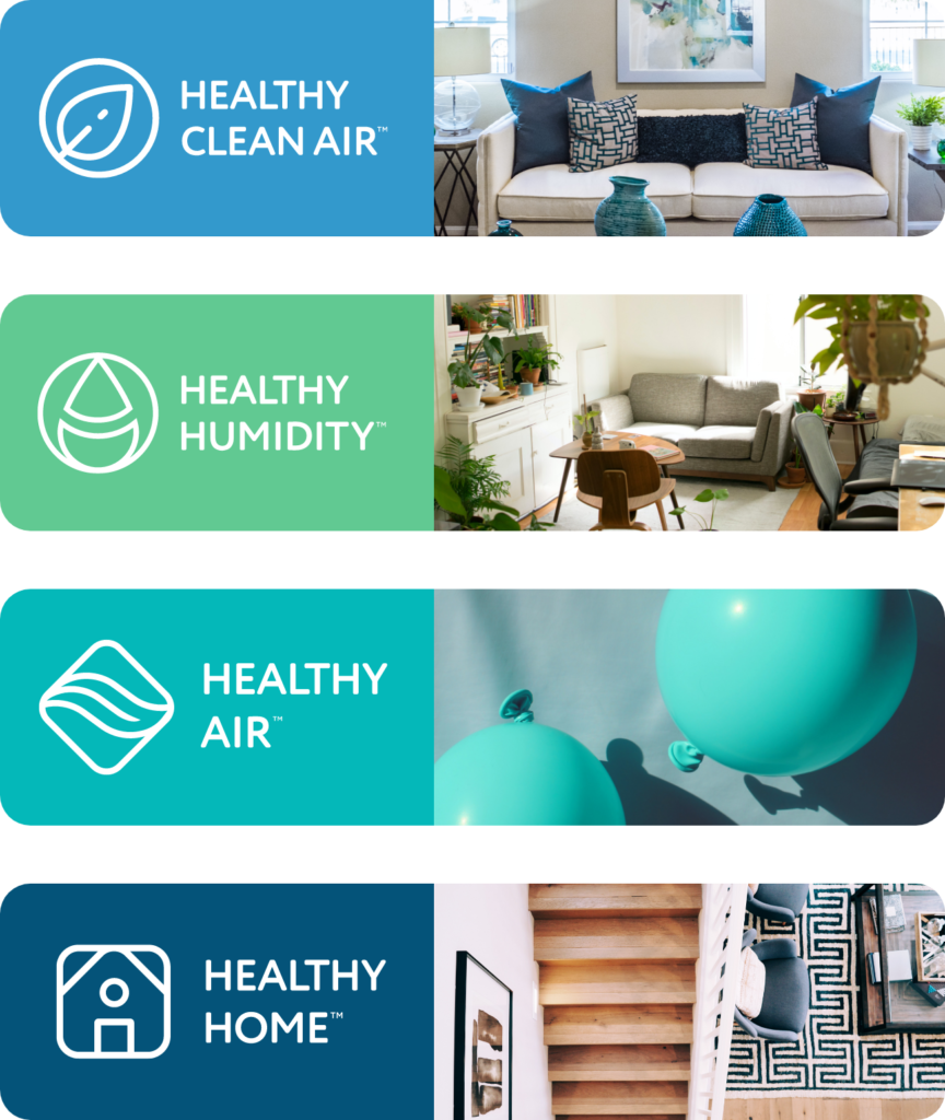
From the creation of the Healthy Air Campaign, then came Healthy Humidity, Healthy Clean Air, and Healthy Home. Each campaign representative of the variables that can impact air quality, like weather and time of year, with their own set of goals for driving awareness to those conditions. It was important to distinguish them visually to indicate that the content was new to the audience and worthy of their attention.
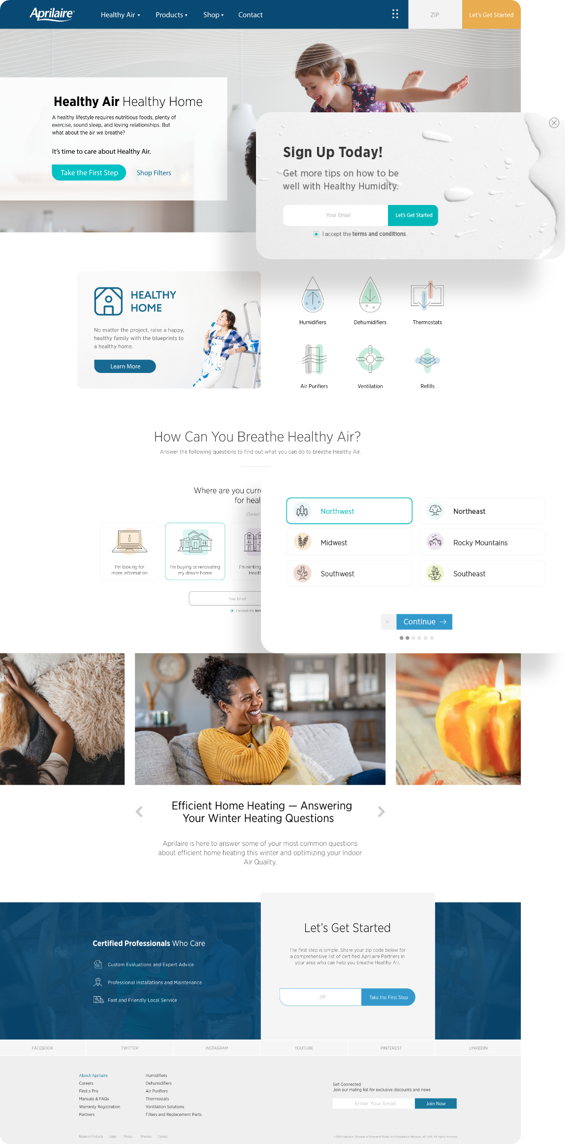
Interactive Landing Pages
Through the introduction of on-page interactive elements, as well as a redesigned blog, the site was transformed into an inviting educational resource to increase consumer trust and loyalty.
The original Aprilaire website had previously been focused on B2B communications exclusively. Separating the site into Aprilaire.com (Hub/B2C) and AprilairePartners.com (B2B) granted the opportunity to take targeted users on a journey to easily navigate through the benefits of having healthy air in their home, as well as take interactive quizzes to determine their individual needs – with the end goal of contacting a Healthy Air Professional for installation.
Information Hub
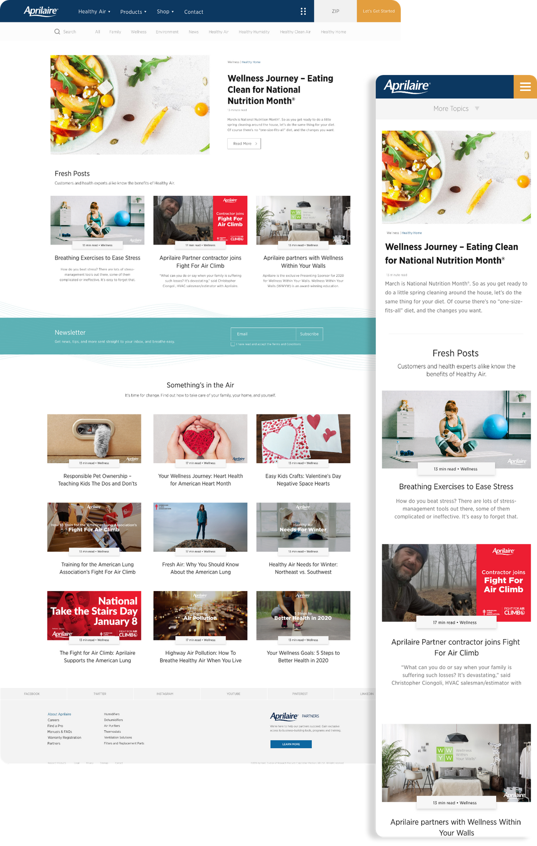
Identified as one of the primary traffic-drivers to the Aprilaire website, the blog presented an opportunity for more than just search optimization.
Taking user experience strategies and optimizing the blog, we streamlined the content to be findable and digestible. By creating content that flows from one blog to the next, it created a seamless transition from blog posts, thus increasing time on page and number of page visits, and organically boosting Aprilaire’s credibility for search engines. With the integration of shareable social media icons, it became easier than ever for Aprilaire’s readers to share content across social media platforms, helping educate and spread the word of healthy air as brand ambassadors themselves.
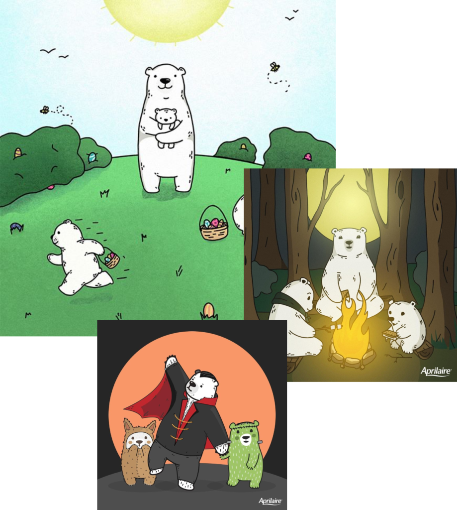
Illustration & Connection
The concept of the bear mascot and its family was crafted as a reflection of Aprilaire’s customer lifestyle. It was also used to increase relatability and position the brand closer to the heart.
I conceptualized, hand- sketched, and digitally inked each of the April Bear graphics. The bear family would be pictured across the seasons and conveyed in a myriad of narratives. The composition’s candid feel was inspired by the idea that these are in fact photographs taken from within the world of the bears, evoking a warm and wholesome feeling when viewed.
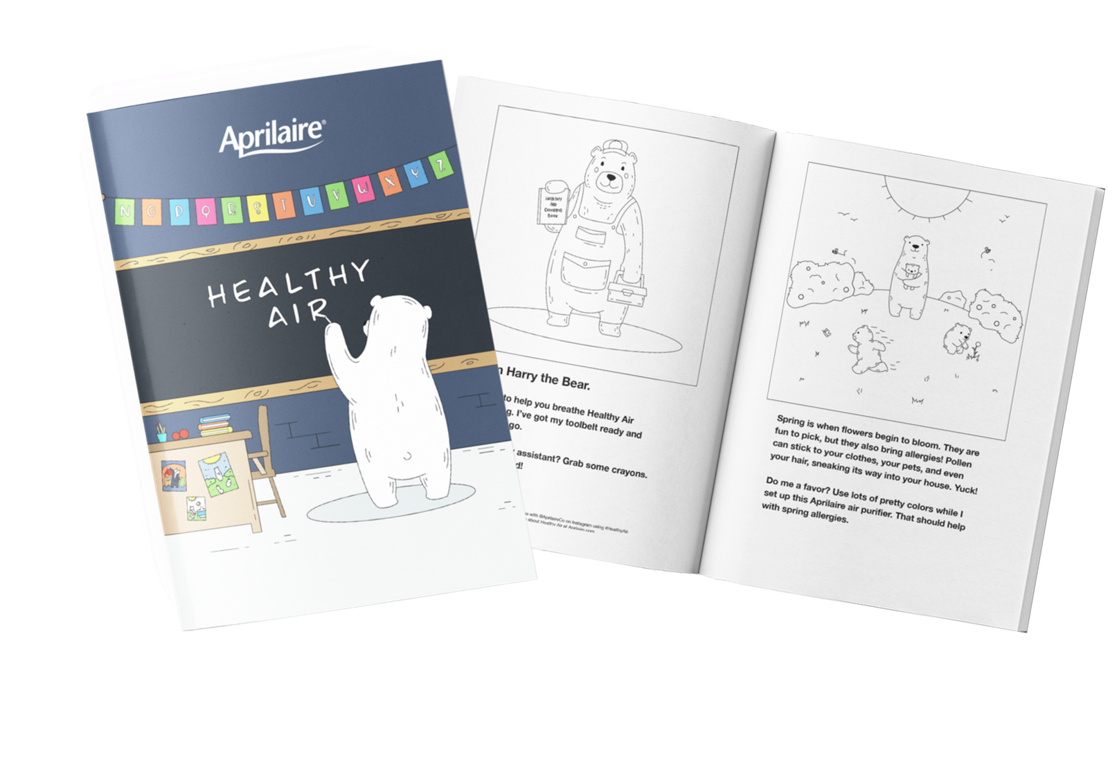
Brand Collateral
Starting from the beginning, a storyboard was created to convey a journey across the seasons that would tell the tale of Healthy Air throughout the year. Each milestone illustration included in the book representative of the key holidays and annual events. Every handmade illustration was redrawn with children coloring in, and out of, the lines in mind. These brand new coloring books were then printed and distributed digitally by Aprilaire’s Healthy Air Professionals to their respective clients for the simple enjoyment of their children.
Branded Social Content
Below, I’ve included some of the my favorite creative executions, showcasing the various content types for organic social: education, seasonal, product, testimonial and aesthetic.
Leave a Reply