The Adventure Challenge
With mobile users making up over 96% of its 1M+ average monthly traffic, we made the call to apply user-centric product design methodologies to this Shopify site, leading to overall improved shopping experience, reduced support tickets, and a 2X increase in CVR.
Role: Creative Director (Growth)
WEB UX/UI
Product Design
Ecommerce
Executive Summary
When I first arrived, The Adventure Challenge presented tremendous opportunity for growth. The DTC Shopify-based site grossed $200k per month in the ‘off-season’ and up to $4M/m in Q4 but was highly under-optimized. Through detailed analysis, we roadmapped several upgrades and hot-fixes (outlined below) that resulting in a CVR increase from 1.9% to 4.1%.
Team
Self, Rob Berryhill, Barret Mize
Client
The Adventure Challenge
Timeline
4 Week Sprint
Tool Stack
Figma, Shopify, Hotjar, GA4, React
Baseline Analysis
When I joined The Adventure Challenge, our primary sales channel had already been underperforming. Bounce rates were abnormally high. To pinpoint where users were getting stuck, we deployed heat maps, session recordings, and targeted customer surveys, laying the groundwork for the optimizations detailed later.
Key Findings & Execution
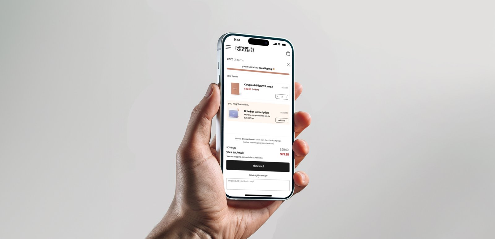
The data exposed many confusing touch points in the checkout flow leading to the high abandonment. As a lean team, we approached these issues in stages starting with a slide cart to allows users more control of their cart to experiment with bundling and reduce the sticker shock on the checkout page.
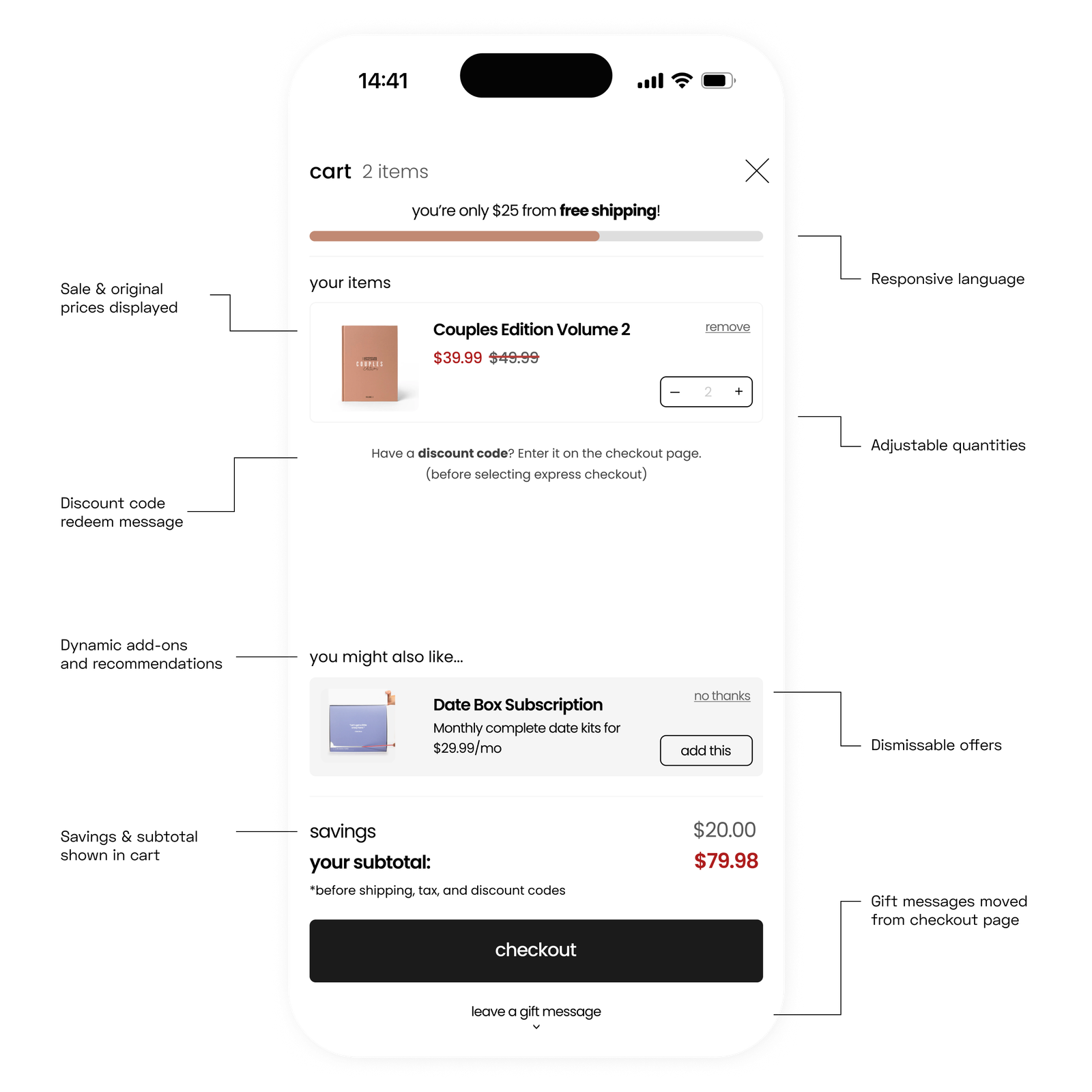
Phase 1: Slide Cart App
Problem
Session recordings and surveys revealed that many customers frequently added and removed items to try and match expected prices, discounts, or bundles. They needed more visibility and personal control and clear incentives when bundling.
Solution
We transformed the cart into a dynamic, user-friendly experience. Subtotals and savings now update visibly in realtime. We also enabled item quantity adjustments and easy item removal. A prominent message reassuring customers that their discount codes would be applied during checkout to address CX concerns.
Bonus: To increase AOV we implemented a gamified free shipping benchmark, and algorithmic recommended add-ons. All of which increased AOV by 22%.
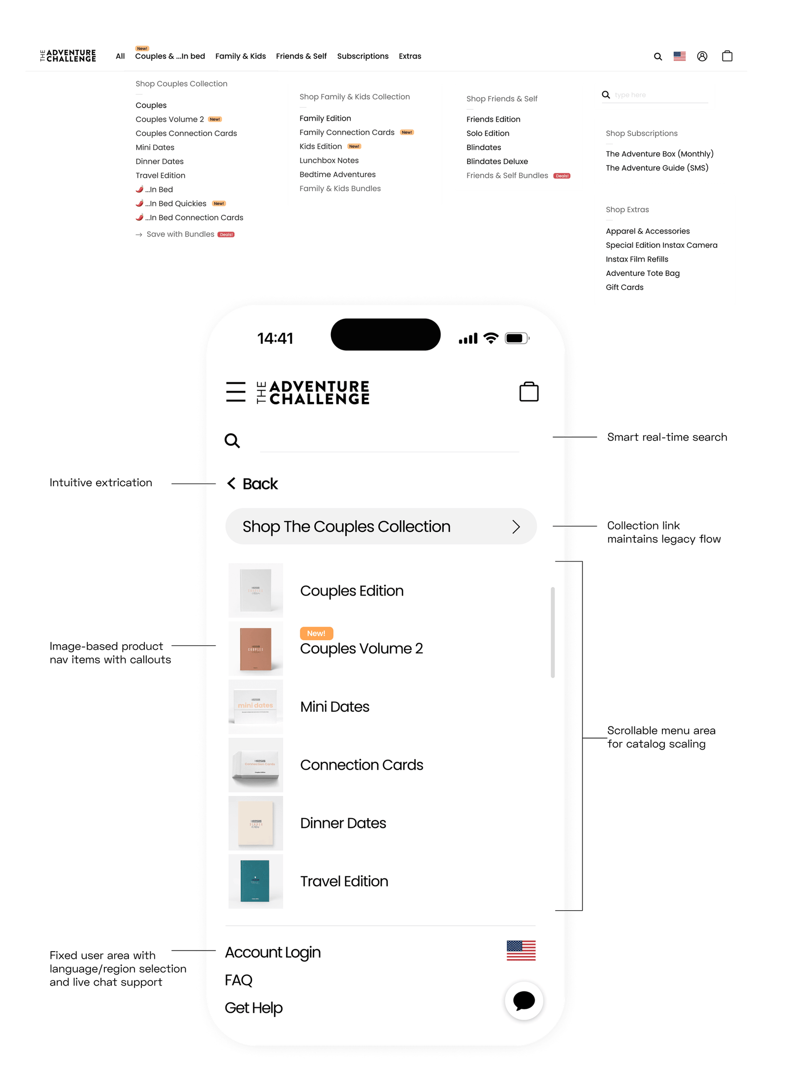
Phase 2: Architecture & Menu
Problem
The default template was designed to support a limited number of products. However, the product line had tripled and this navigation structure became inefficient. Users were being directed to paginated collections—some containing up to nine subpages—which lead to browsing fatigue, and quite often abandonment.
Solution
The new app-inspired menu approach would allow users to see products directly in the menu by adding thumbnails users are able to visually identify products, thus removing up to 9 clicks from the purchase journey. The top and bottom areas of the menu are fixed for permanent access to extrication, account, and help links; while the product menu is scrollable to support the scaling catalog.
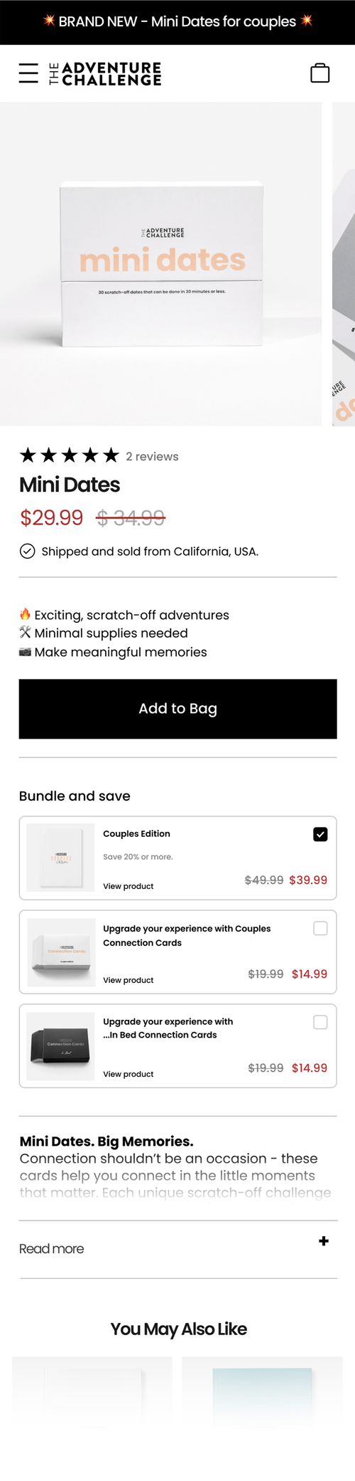
Phase 3: Boosting CVR by 2X
Problem
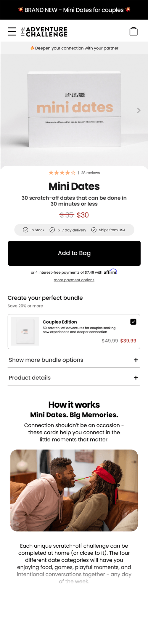
Over 85% of traffic landing on PDPs came from high-CTR ad sources, yet the site’s average conversion rate (CVR) remained below 2%, signaling deeper UX challenges. Users struggled to understand the product’s value, partly due to the minimalist packaging and lack of available description.
Solution
To enhance product clarity, build trust, and reduce friction we created a more intuitive and engaging product page with the goal of each one functioning more like a landing page. The image carousel was cropped in on the product, a dynamic value prop banner was added that would allow us to test messaging, and product descriptions previously hidden behind toggles are now part of the ‘how it works’ section.
These cumulative changes resulted in a 2x increase in CVR.
L: Before | R: After